Launched
Launched
ISE - Room product
ISE - Room product
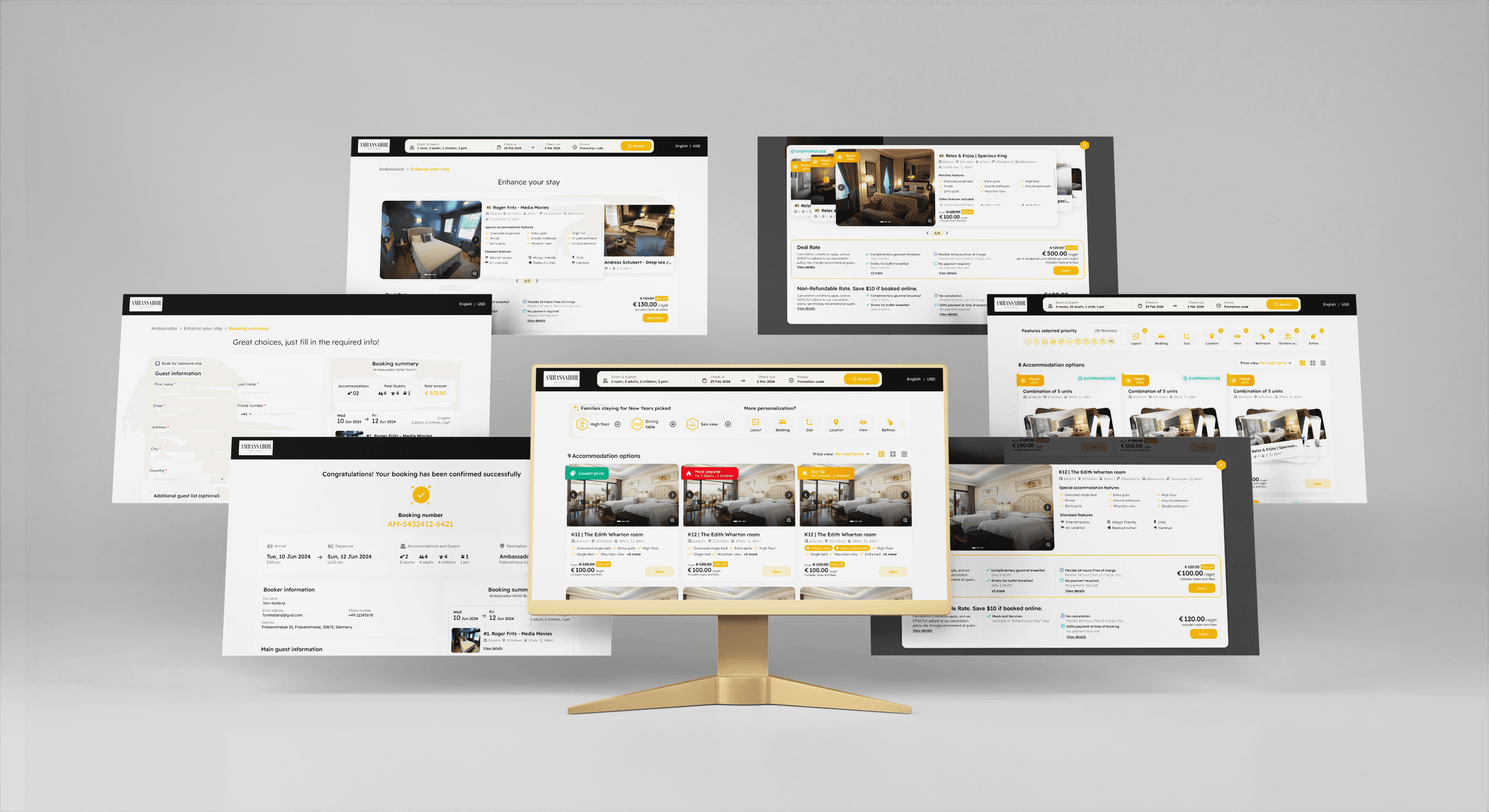
About the hotel industry and a new way to sell room products. The project includes two sites: a platform for admin and ISE for end-users.
About the hotel industry and a new way to sell room products. The project includes two sites: a platform for admin and ISE for end-users.
Hotel
Hotel
Responsive
Responsive


Role
Role
UX/UI Designer
UX/UI Designer
Duration
Duration
8 weeks
8 weeks
Tools
Tools
Figma
Figma
Teammate
Teammate
Hien Cao (PM)
Hien Cao (PM)
Nam Hoang (PM)
Nam Hoang (PM)
Tran Pham (UX/UI)
Tran Pham (UX/UI)
Thu Bui (UX/UI)
Thu Bui (UX/UI)
About GauVendi ISE
About GauVendi ISE
GauVendi ISE is a platform aimed at facilitating hoteliers in selling their rooms, sales plans, bundles and extra services more efficiently. For end-users, ISE helps them discover their ideal room effortlessly, prioritizing hyper-personalization. Users can choose their preferred room at the most reasonable price. Also, hoteliers can customize the interface colors of the ISE to align with their hotel's branding, ensuring consistency with their brand identity.
GauVendi ISE is a platform aimed at facilitating hoteliers in selling their rooms, sales plans, bundles and extra services more efficiently. For end-users, ISE helps them discover their ideal room effortlessly, prioritizing hyper-personalization. Users can choose their preferred room at the most reasonable price. Also, hoteliers can customize the interface colors of the ISE to align with their hotel's branding, ensuring consistency with their brand identity.
The story
The story
As Henry Ford once said, “If you always do what you’ve always done, you’ll always get what you’ve always got.” and this quote is one of the reason why we decision to revamp the ISE room product. We recognize the importance of evolving and improving to meet the needs of our users. By refreshing the new looks, we aim to deliver a better user experience.
As Henry Ford once said, “If you always do what you’ve always done, you’ll always get what you’ve always got.” and this quote is one of the reason why we decision to revamp the ISE room product. We recognize the importance of evolving and improving to meet the needs of our users. By refreshing the new looks, we aim to deliver a better user experience.
Process
Process
1
1
Understand
Understand
2
2
Research
Research
3
3
Wireframe
Wireframe
4
4
UI design
UI design
5
5
Prototype & Test
Prototype & Test
Problems
Problems
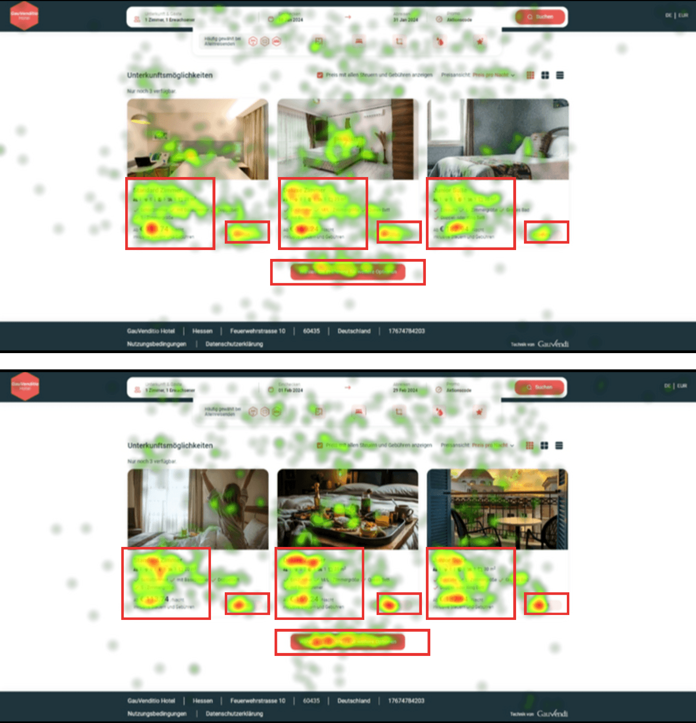
After we revamped the ISE room product in mid-2023, we received feedback from our client, Mr. Markus, shortly after its launch. The feedback highlighted several issues with the room product, including unclear room capacity information, outdated style, and messy pricing when using promotion codes. After hearing this feedback, I was put in charge of revamping the new ISE room product for 2024. Below are my responsibilities during this time.
After we revamped the ISE room product in mid-2023, we received feedback from our client, Mr. Markus, shortly after its launch. The feedback highlighted several issues with the room product, including unclear room capacity information, outdated style, and messy pricing when using promotion codes. After hearing this feedback, I was put in charge of revamping the new ISE room product for 2024. Below are my responsibilities during this time.


Responsibilities
Responsibilities
Research competitors, OTAs room rates, and other hotel websites.
Research competitors, OTAs room rates, and other hotel websites.
Hold meetings at each design phase to update to the PM, Client, and Design team.
Hold meetings at each design phase to update to the PM, Client, and Design team.
Recommend and identify necessary additions or reductions in information and data.
Recommend and identify necessary additions or reductions in information and data.
Set up components in Figma file perfectly for easier maintenance in the future.
Set up components in Figma file perfectly for easier maintenance in the future.
Making prototypes for client presentations and handover to developers.
Making prototypes for client presentations and handover to developers.
Collaborate with dev team to ensure seamless integration of design elements and functionality.
Collaborate with dev team to ensure seamless integration of design elements and functionality.
Competitor research
Competitor research



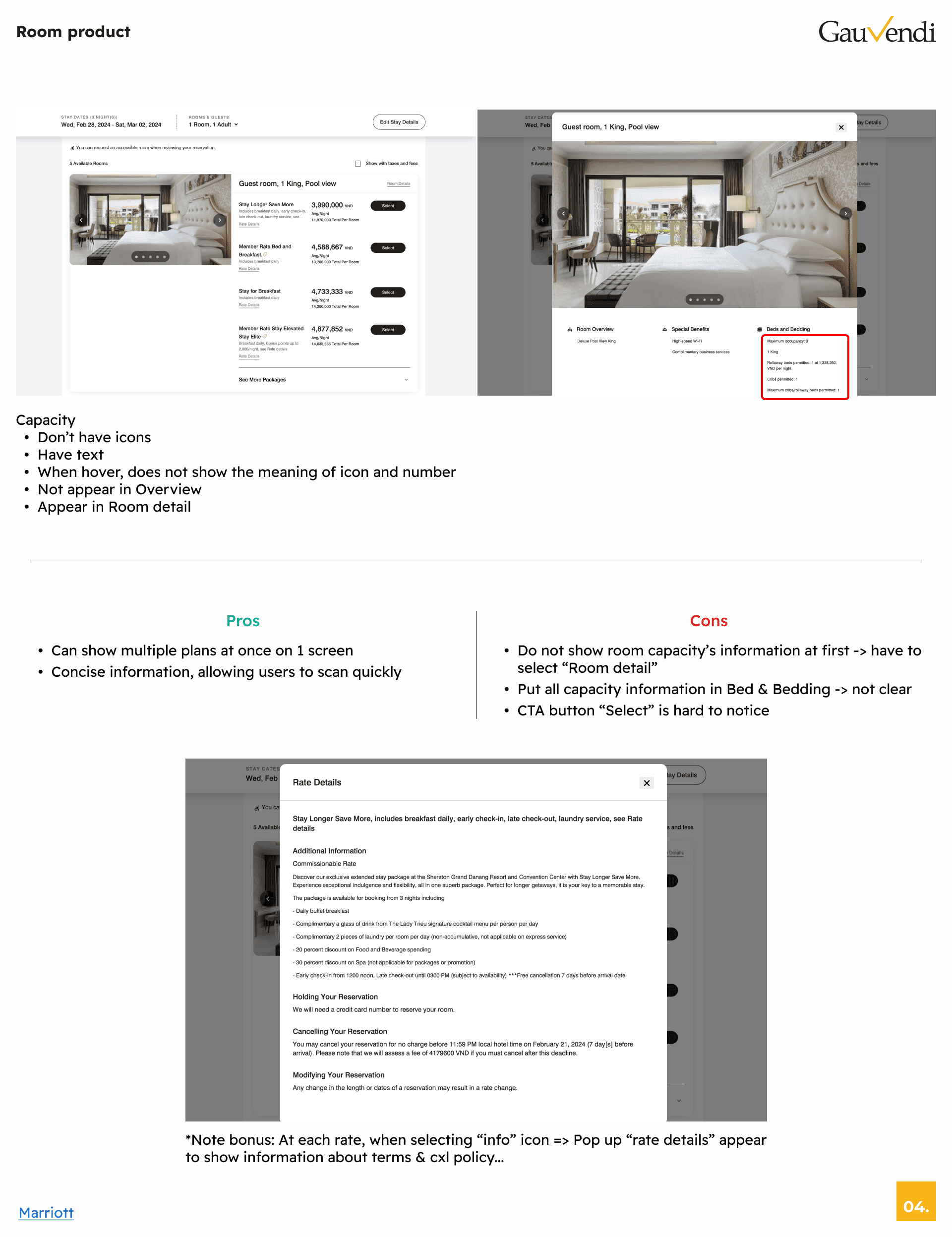

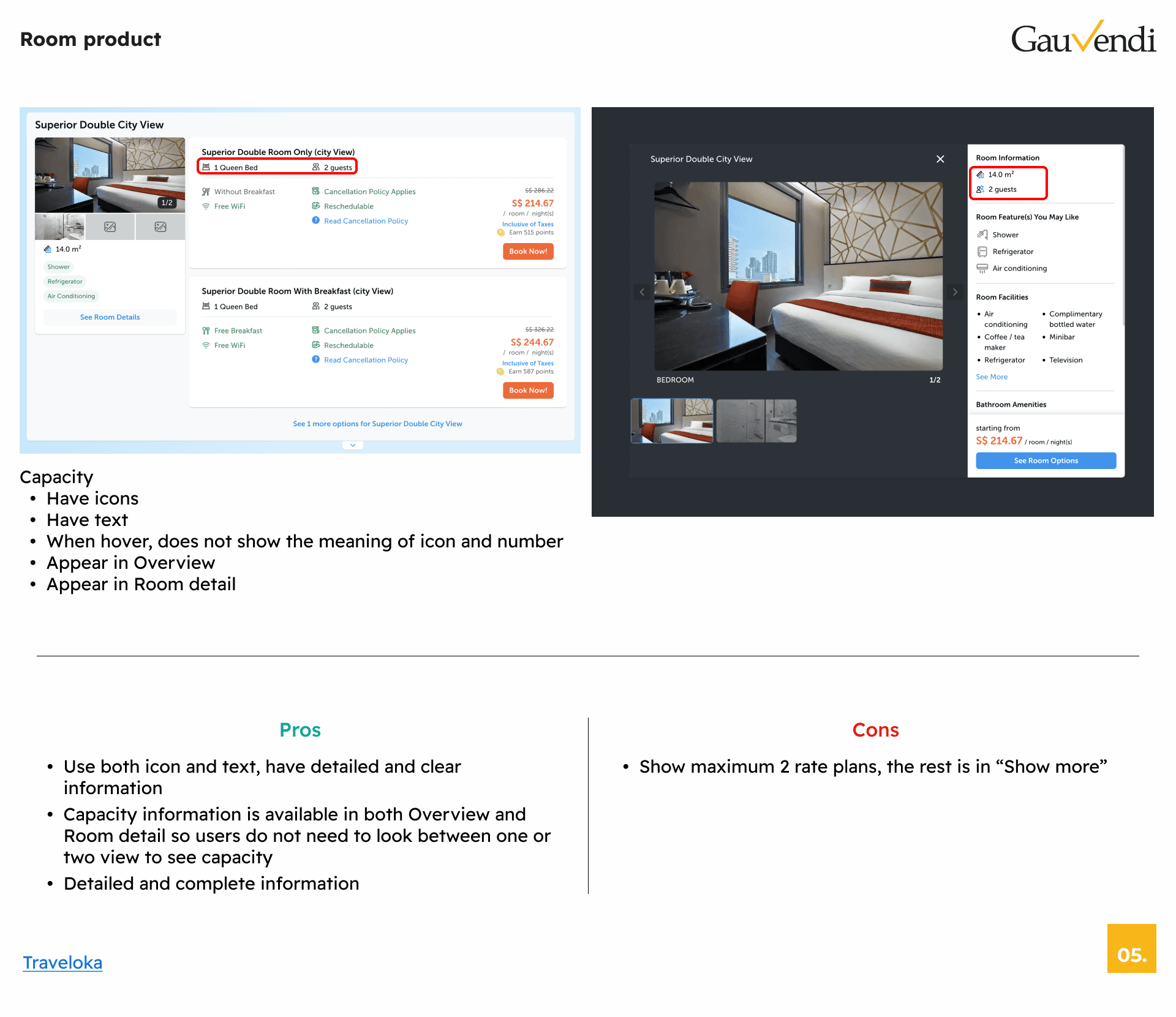

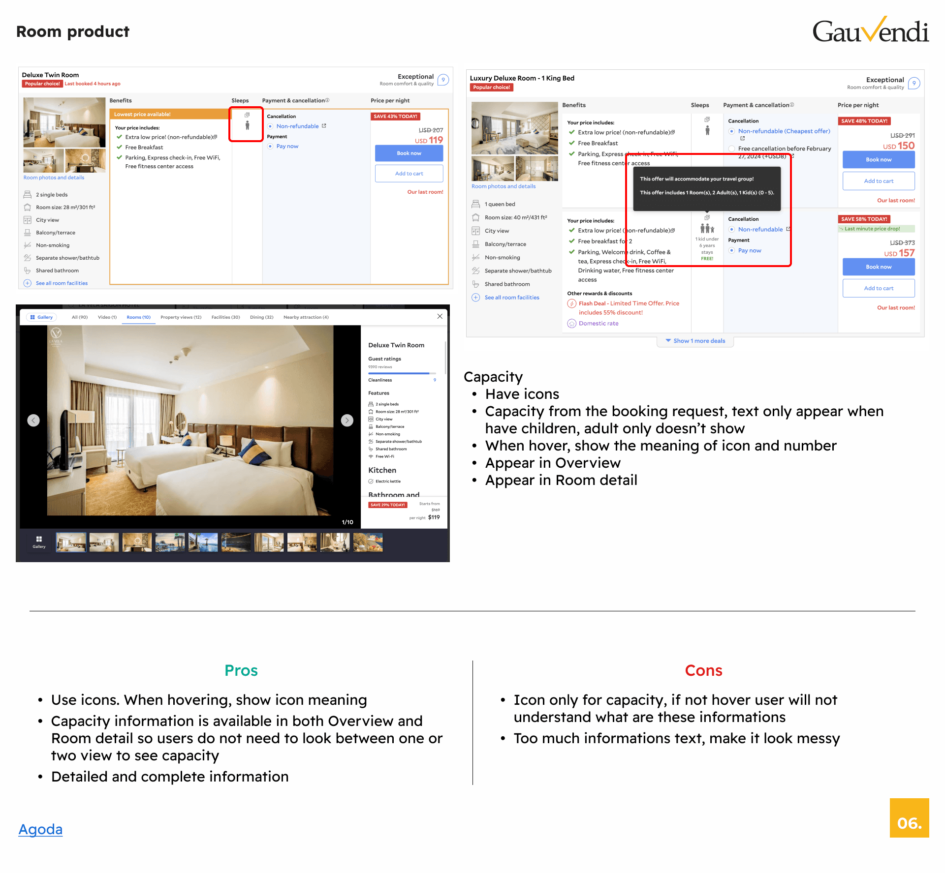

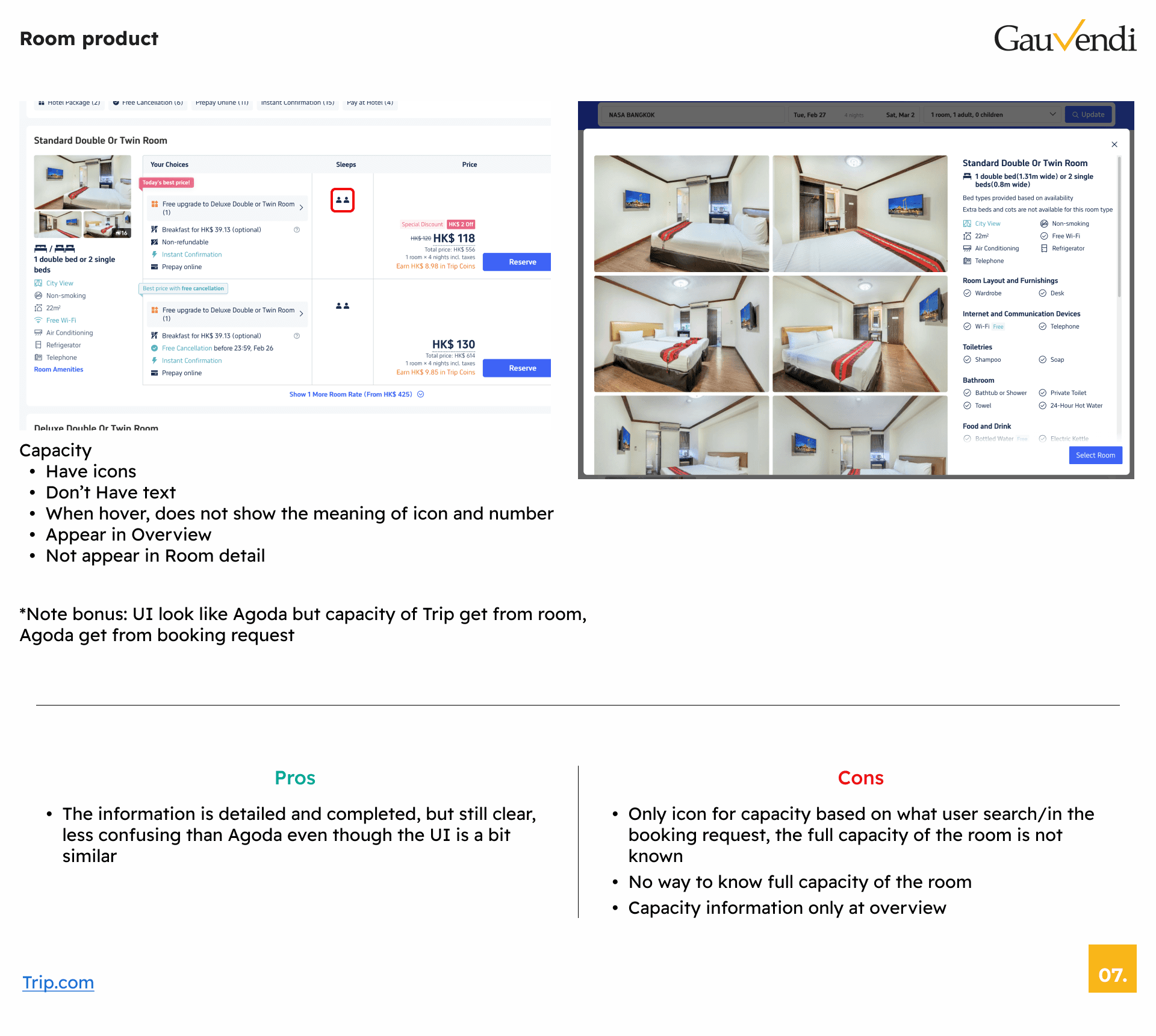




What I've found?
What I've found?
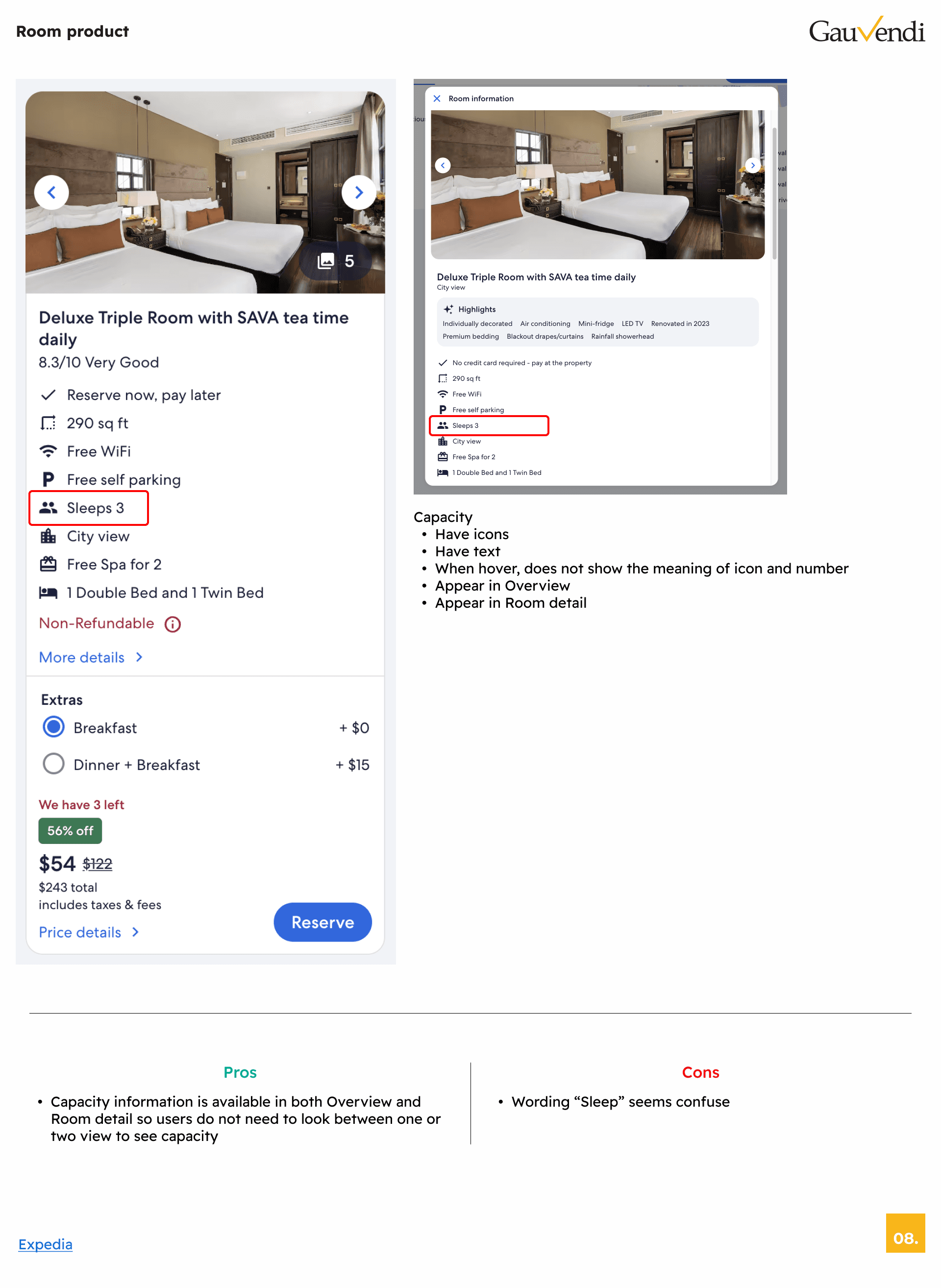
Capacity
Capacity
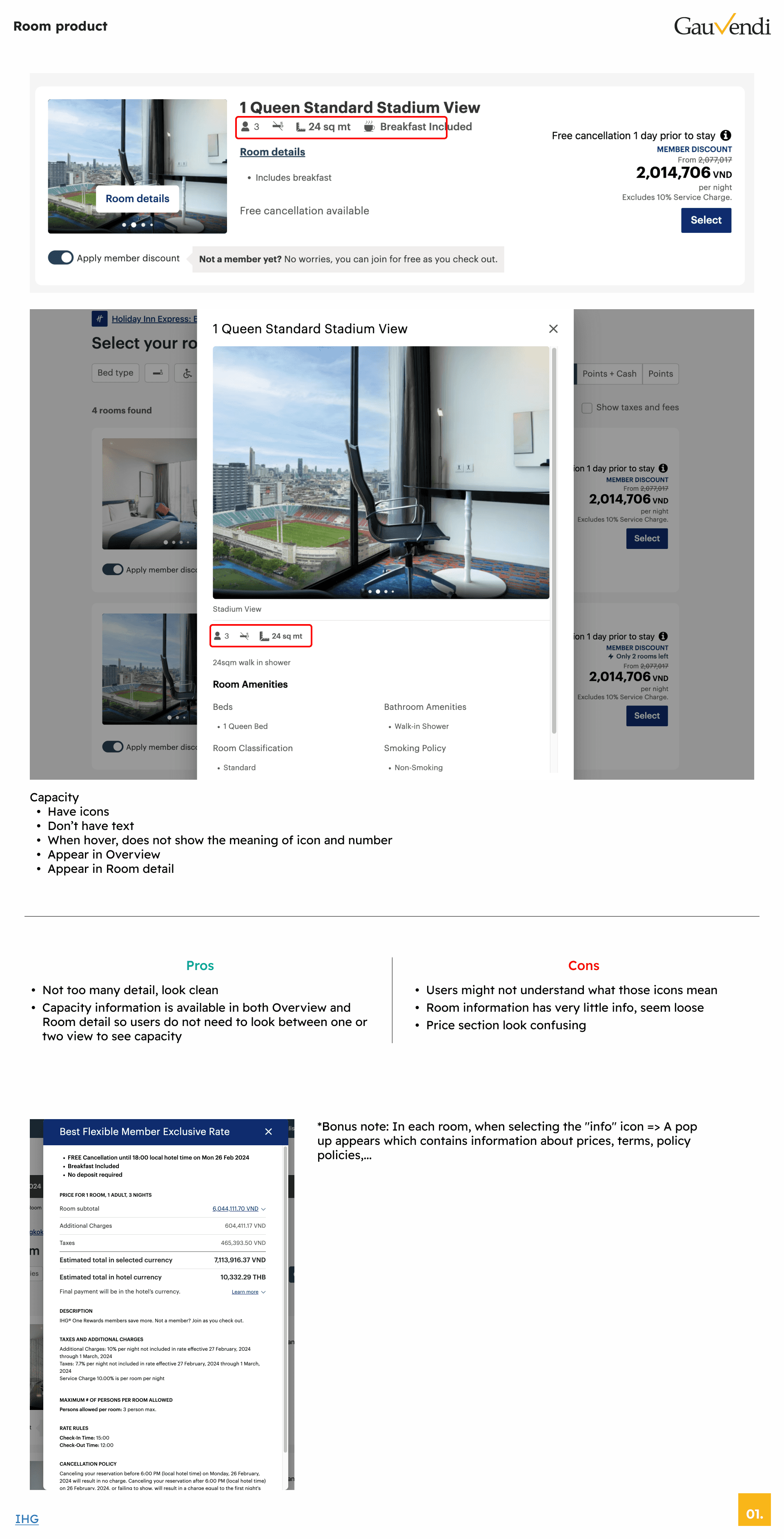
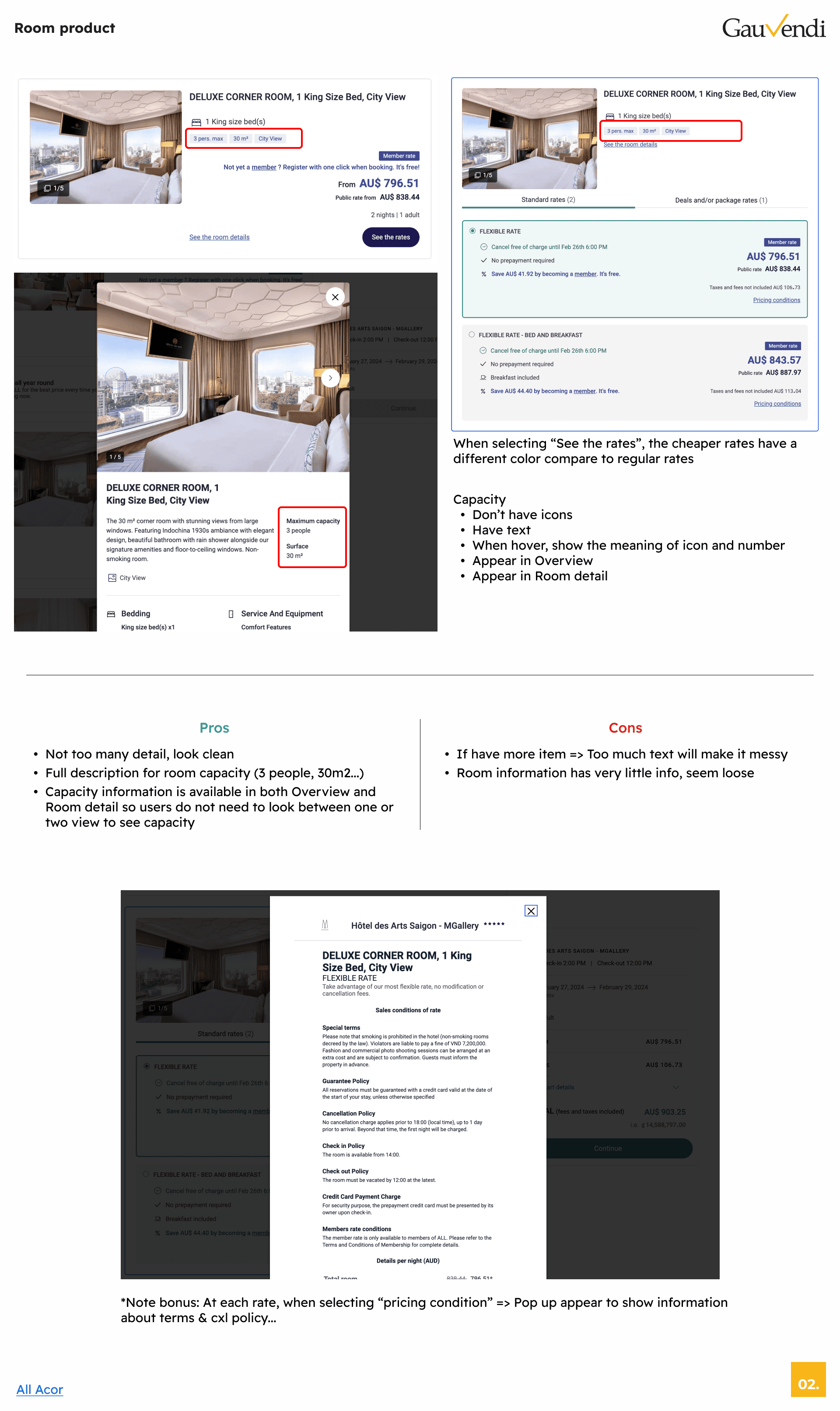
There are 2 ways to display: 1 is icon, 2 is detailed text. If using icons, there will be hover to show details, but this method will not be optimal for mobile users.
There are 2 ways to display: 1 is icon, 2 is detailed text. If using icons, there will be hover to show details, but this method will not be optimal for mobile users.
Rates information
Rates information
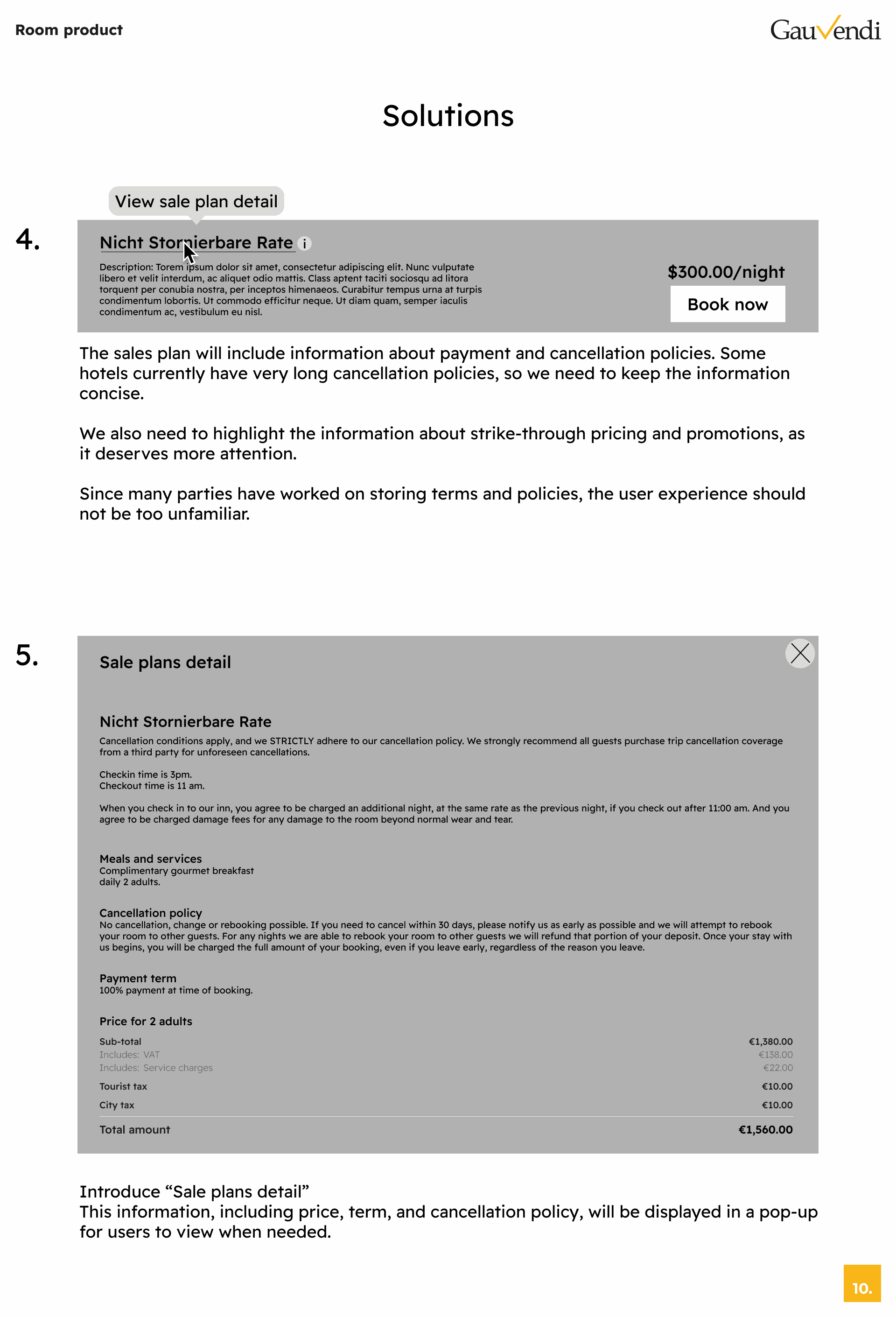
The detailed information about pricing, terms, and CXL policy will not be displayed directly but will be placed in a pop-up for users want to view.
The detailed information about pricing, terms, and CXL policy will not be displayed directly but will be placed in a pop-up for users want to view.
Product detail
Product detail
Each OTA/hotel website has a different way to display, some use pop-ups, some redirect to separate pages. However, GauVendi has been using the collapse/expand signature behavior since 2022, so we will keep it.
Each OTA/hotel website has a different way to display, some use pop-ups, some redirect to separate pages. However, GauVendi has been using the collapse/expand signature behavior since 2022, so we will keep it.
Strikethrough price
Strikethrough price
Most of the displayed prices bring a feeling of a discount, and this section very prominent, evokes user a desire to book.
Most of the displayed prices bring a feeling of a discount, and this section very prominent, evokes user a desire to book.
Solutions
Solutions
After conducting thorough research and analyzing, I've come up with several solutions to enhance user experience. These solutions are designed with the purpose of resolving existing issues and providing users with a better experience. Let's take a look of these proposed solutions and see how they make a positive impact on our ISE.
After conducting thorough research and analyzing, I've come up with several solutions to enhance user experience. These solutions are designed with the purpose of resolving existing issues and providing users with a better experience. Let's take a look of these proposed solutions and see how they make a positive impact on our ISE.
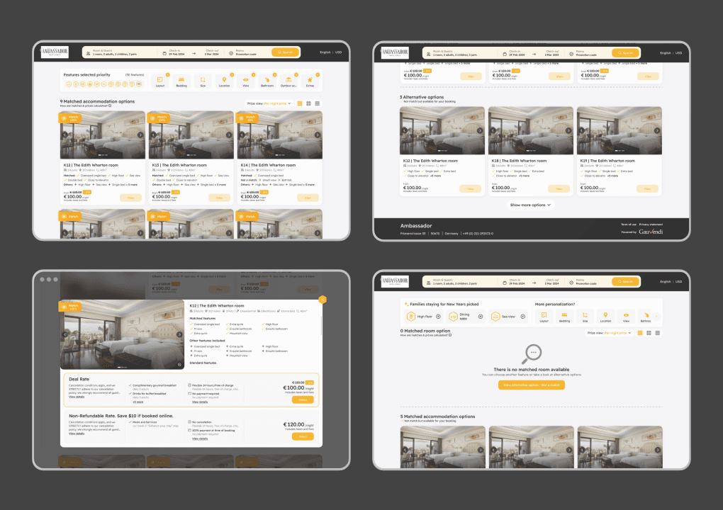
1. Product card
1. Product card

Before
Before
Problem
Problem
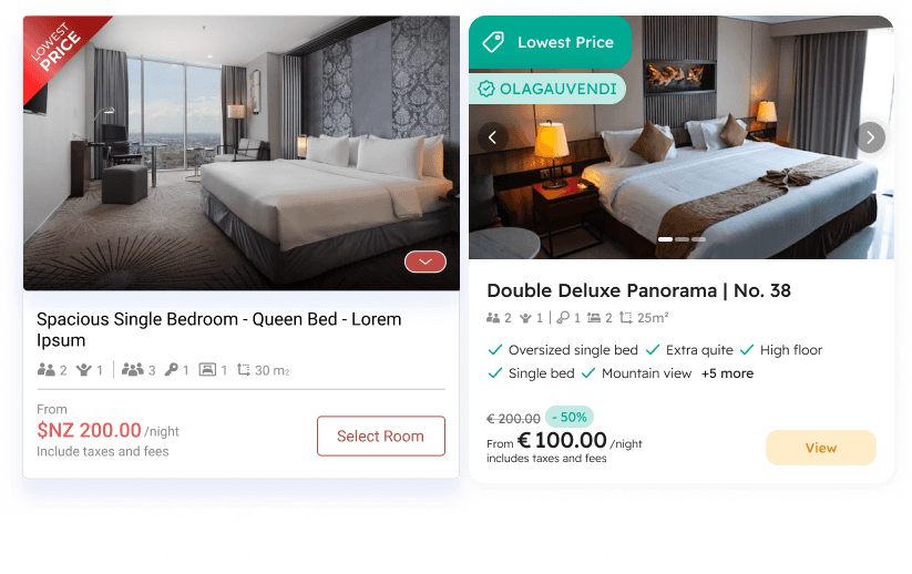
The capacity information is not clear, user don't know what are those icon mean, hover can not work on mobile
The capacity information is not clear, user don't know what are those icon mean, hover can not work on mobile
Graded label not eye-catching
Graded label not eye-catching
Promotion code when apply not so special
Promotion code when apply not so special
The 2022 doesn't have the feature of the room product & can not quick view images of the room
The 2022 doesn't have the feature of the room product & can not quick view images of the room

After
After
Solutions
Solutions
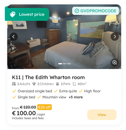
The capacity information is now more prominent, reduce unnecessary information
The capacity information is now more prominent, reduce unnecessary information
Graded label modern with new style (ribbon and gradient)
Graded label modern with new style (ribbon and gradient)
Promotion code apply and show directly save how much money
Promotion code apply and show directly save how much money
Bring back a "Zoom" button to show a full image in a big pop-up
Bring back a "Zoom" button to show a full image in a big pop-up
Check icon color and sale off tag now using hotel's primary color
Check icon color and sale off tag now using hotel's primary color
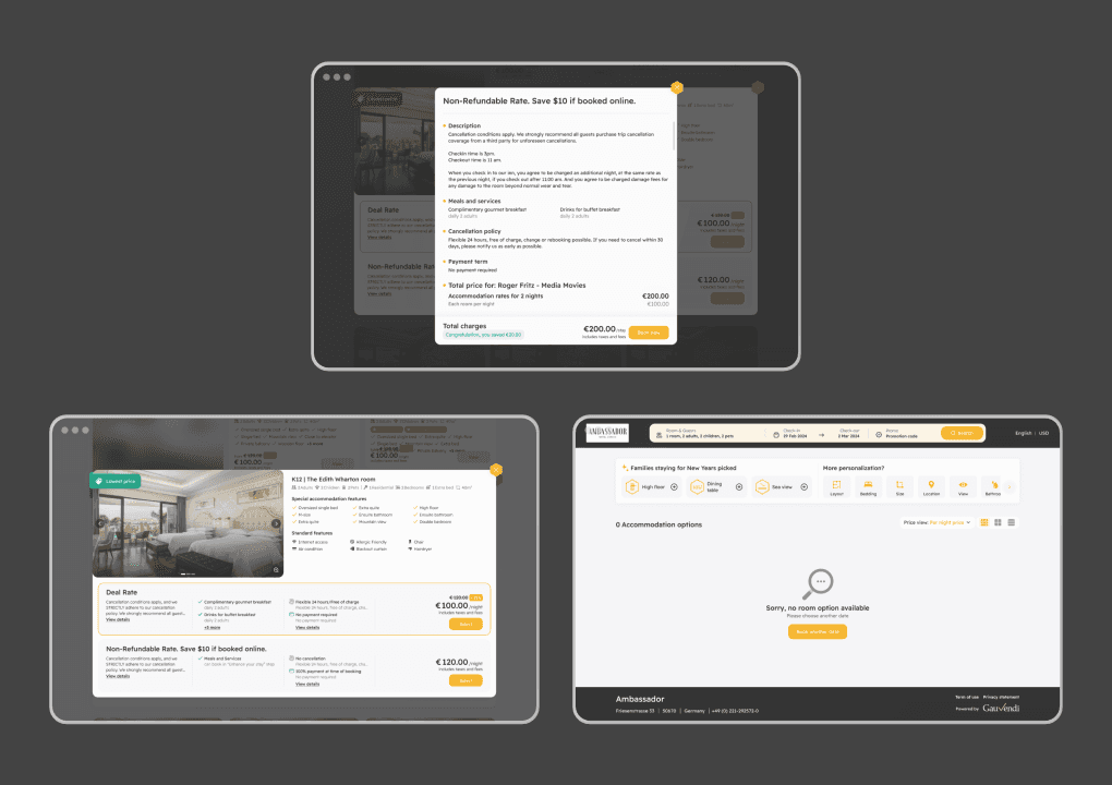
2. View detail
2. View detail


Before
Before
Problem
Problem
View detail of 2022 is so confusing the user, they don't really know what room is selected
View detail of 2022 is so confusing the user, they don't really know what room is selected
Didn't have the highlight sale plan to suggest user make booking
Didn't have the highlight sale plan to suggest user make booking
The way to close the detail is not clear
The way to close the detail is not clear


After
After
Solutions
Solutions
Overlay whole page to show only selected room products
Overlay whole page to show only selected room products
Highlight the suggestion sale plan
Highlight the suggestion sale plan
Close button cut-out to make it more prominent and can custom color as a primary color of hotel
Close button cut-out to make it more prominent and can custom color as a primary color of hotel
3. Sale plan detail
3. Sale plan detail


Before
Before
Problem
Problem
This is all information of the sale plan that user can see
This is all information of the sale plan that user can see
Some hotel write description of sale plan very long and make the height looks odd
Some hotel write description of sale plan very long and make the height looks odd
Cancellation policy and Payment term are sometime very long
Cancellation policy and Payment term are sometime very long
Some user did't care about the sale plan information
Some user did't care about the sale plan information

After
After
Solutions
Solutions
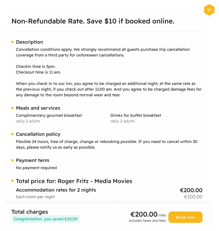
Introduce a new "Sale plan detail" component, everything about the sale plan in here
Introduce a new "Sale plan detail" component, everything about the sale plan in here
Hotel now can write whatever they want
Hotel now can write whatever they want
For user who want to know more about CXL policy, payment term, pricing they can have it here
For user who want to know more about CXL policy, payment term, pricing they can have it here
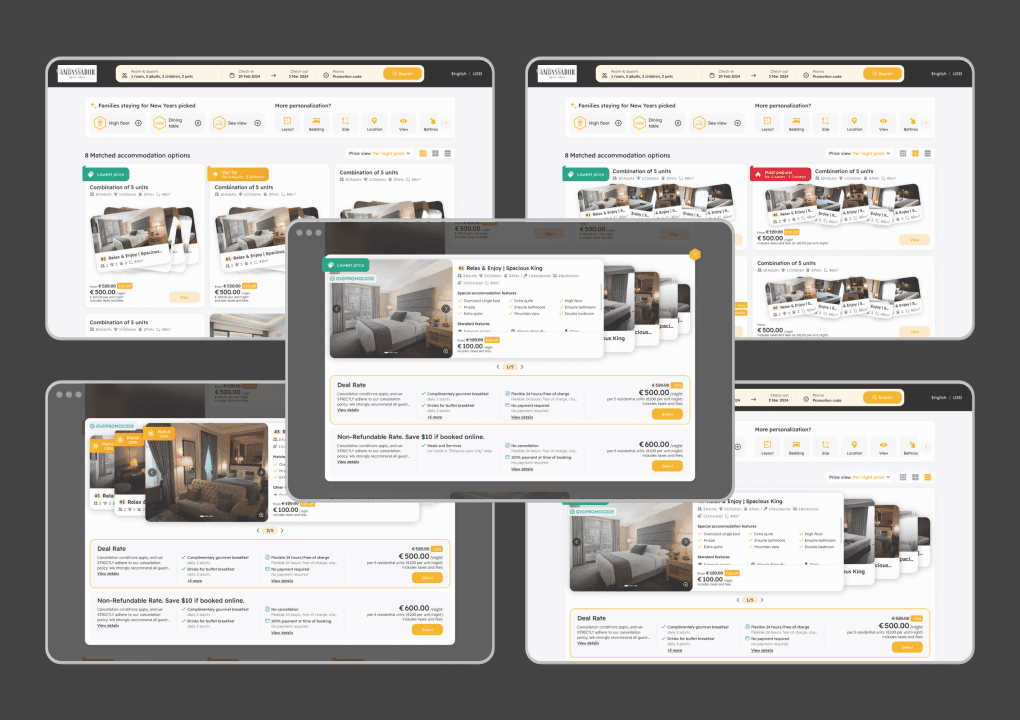
4. Multiple room
4. Multiple room


Before
Before
Problem
Problem
The display not bring the feeling that user are booking a multiple room
The display not bring the feeling that user are booking a multiple room
Some user didn't know the different
Some user didn't know the different
The tab to switch between each room are also not prominent
The tab to switch between each room are also not prominent

After
After
Solutions
Solutions
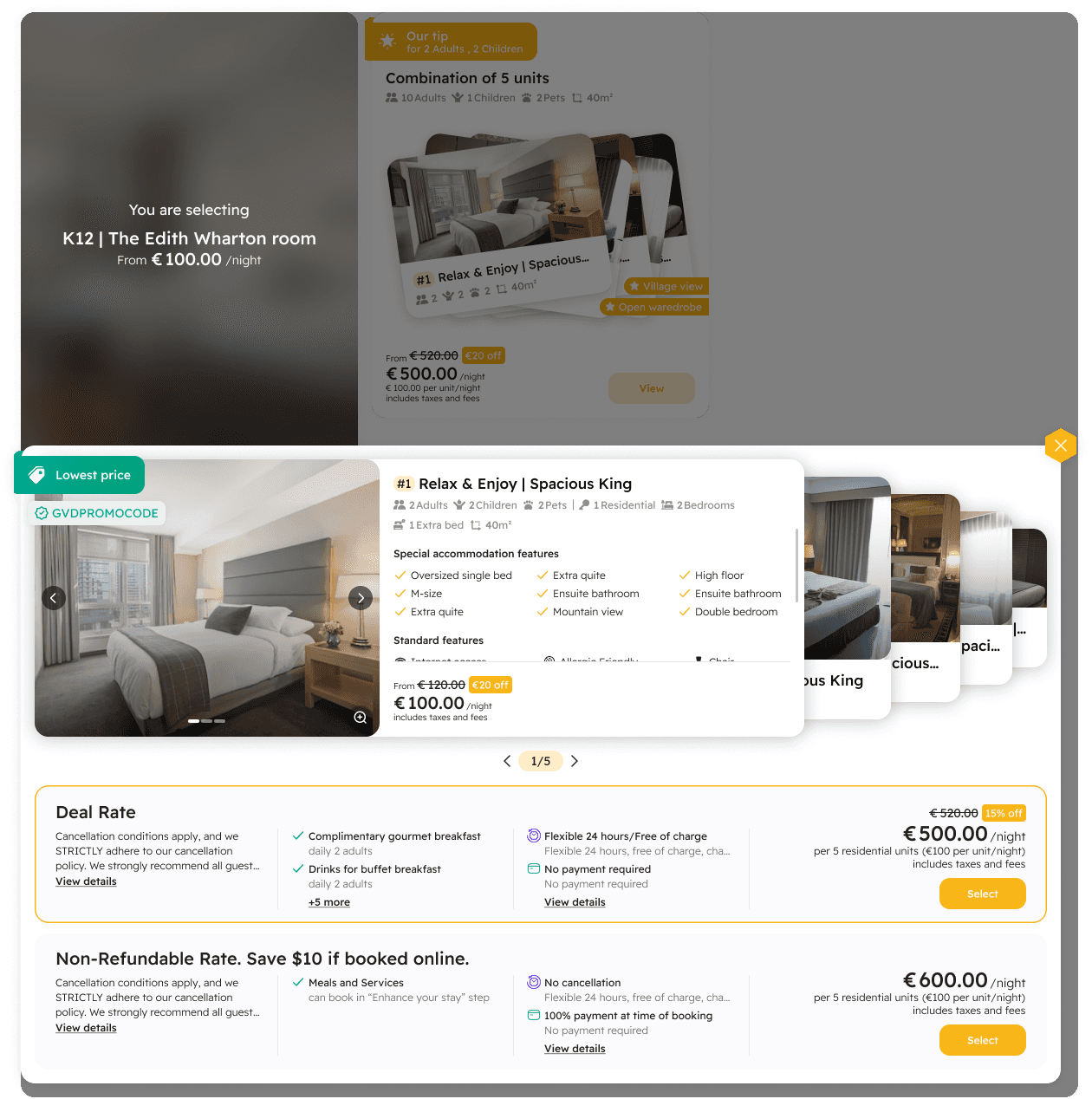
New layout like card stacking to help user know that they are booking more than 2 rooms
New layout like card stacking to help user know that they are booking more than 2 rooms
User now can see clearly how many room they are booking
User now can see clearly how many room they are booking
Look more impressive than the old one
Look more impressive than the old one
Some of more than 150 hotels are using GauVendi ISE:
https://booking.gauvendi.com/recommendation?hc=GVLENCOR&lang=en
https://booking.gauvendi.com/recommendation?hc=GVCGNART&lang=en
https://booking.gauvendi.com/recommendation?hc=GVMUCHAR&lang=en
https://booking.gauvendi.com/recommendation?hc=GVBORART&lang=de
https://booking.gauvendi.com/recommendation?hc=GVVALJUR&lang=de
Heatmap:
https://drive.google.com/file/d/1Wt8xiE71O0PDnSUNd2nhM3Cqfal-ylvE/view?usp=drive_link
Heatmap:
https://drive.google.com/file/d/1Wt8xiE71O0PDnSUNd2nhM3Cqfal-ylvE/view?usp=drive_link


